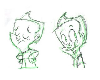
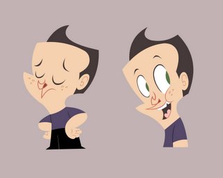
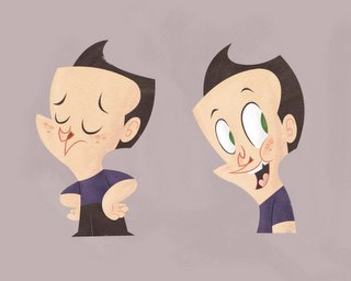
Recently, Ryan's been writing a kids book called, Mumfin. So I thought I'd have a go at designing the characters. This is the little boy so far. There's also a little girl and Mumfin himself (a creature thingy) so I'll probably do them to when i have a spare moment.
We're considering doing it in anaglyph 3d (the red and green glasses kind) so I'll do some tests and see if it's worth doing. I'll post them up for some feedback too, once they're done.
Enjoy
Tim


13 comments:
Wow! Very nice! I think I prefer the textured one. No suprise there though, right?
That texture you're using is great. How'd you do that (if you dont me asking)?
Lovely bloggin' you guys are doing here! All your designs are really great. Thanks for visiting my blog, and for your kind words, and letting me know you're out there. I'll definitely be coming back!
Thanks for the kind words guys.
The shading was painted on in photoshop, with a chalk brush and a one of the standard textures (not sure if it has a name or not) it's on the right hand side in the middle if that helps.
I added a slight paper texture to it afterwards using an overlay layer and an image i found on google. But it's very light, somost of it is probably the brush.
Thanks again for the compliments.
Tim
great character so far. I love how you take such simple shapes and create a very cool character. look forward to seeing more.
Wicked awesome designs! And cool title, too. Mumfin.
A 3D children's book would be so cool. Unless I'm totally clueless, that classic 2-tone process isn't really utilized anymore.
nice character design!
love the textures!
these designs are solid man. can't wait to see more
Cheers guys, thanks for the kind words. We've just done a fairly successful 3d test, so it looks like it might work. We'll post the test soon, so if you've got some spare 3d glasses, whip 'em out and get 'em ready.
Note: leaving the "th" off "them" is radical and hip.
Oh no. I love saying 'em.
If it becomes hip, I'll have to put it in the closet along with my Super Mario T-shirt and plastic trucker hats till the fad wears off.
really solid design, keep going!
hehe.. awesome designs
Very nice design sense. I like the texture......Cool purple painting up top too. Sweet!
Post a Comment